Like any digital content, emails are accessible when created in a way that people experiencing an impairment or disability—whether permanent, temporary, or situational—can understand. When content is accessible it works with assistive technologies like screen readers, personal voice assistants (e.g. Siri, Alexa, etc.), speech to text, screen magnifiers, braille displays, keyboards, switches, etc. When emails are composed with accessibility in mind, they work better for everyone.
While various email programs and applications may vary in terms of what modifications can be made, there are some basic steps you can take with your content to help improve email accessibility.
The examples and screenshots used below were created in Gmail.
Be clear with the email subject line
The subject line is basically a title for your email. Keep it succinct and meaningful. You want to get the reader's attention in the most direct way possible. The subject line should provide the reader with a clear understanding of what the email entails. Avoid the use of punctuation and all caps, unless absolutely necessary.
Write in clear and simple language
When writing an email, keep the language simple, clear, and understandable. Remember that emails are generally meant to be a brief form of communication, and are usually skimmed or read quickly, so keep the information direct and to the point.
Keep to one main point or idea per paragraph. Write short sentences and small chunks of text with concise ideas. Avoid jargon in general communications, when possible. Start with the most important information first, followed by necessary details, with general or background information at the end.
Using clear and simple language ensures readers are in the right place, helps a wide audience, and allows people to understand information the first time they read it. Disciplinary content should be more specific.
Use headings, paragraphs, and lists
Just as sighted users can visually scan a document, assistive technology can also “scan” a document or email if it is structured properly. Separate, or chunk, the information into short, concise paragraphs. If the email application allows, create headings within longer emails. When applicable, use the built-in bulleted or numbered list feature to separate list items and ensure good readability.
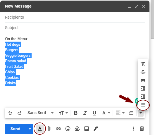
To style a list:
- Highlight the appropriate text
- Select Formatting Options (the underlined “A” icon)
- Select the bulleted or numbered list icon
Consider font size and style
Keep the font size at a minimum of 12pt and the font style simple. Script fonts are much more difficult to read than plain sans-serif or serif fonts. Examples of good fonts include Open Sans, Verdana, Georgia, Roboto, and Merriweather. The default or “normal” setting for size and style in most email programs is most likely sufficient.
Explain attachments
Assistive technology does not always alert users to email attachments. It is highly discouraged to simply direct readers to the attachment. In the case of a one-page document, such as a flyer, office memo, event invitation, etc., the most important information should be written in the body of the email with a note that a document is attached. Ideally, the body of the email contains all the pertinent information and the attachment can be eliminated. If the attachment is multiple pages, such as a newsletter, provide a brief summary or description and note the attachment.
Provide text equivalents
Any images that are included in the email should have a description of what the image represents. This is called text equivalents or alt text. Including alt text allows people who can’t see images to understand what they mean. However, in many email applications, the option to include alt text may not be available. Key content from an image or an attachment should be included as text in the body of the email (for example, relevant information for an event invitation). If an image adds no meaning to the email, consider removing it.
Be aware of color contrast
Not everyone is going to be able to see color variations, and assistive tech will not discern color changes. Therefore, color cannot be the only means of relaying information. Use a secondary attribute to provide emphasis (bold, italics, outline, etc). It is generally best practice that an underline is reserved for clickable link text.
Provide high color contrast to help ensure readability for people with color blindness or other visual impairments. Dark text on a light background is the best option. You can check the color contrast easily by previewing the email in greyscale. If color has no purpose or is not necessary, it's suggested not to include it.
Provide descriptive hyperlinks
Hyperlink text should clearly describe where the link goes. Assistive technology can scan content using links, which means the user hears the link text out of context. Therefore, the link text should be concise and meaningful. Do not include full URLs, as assistive technology reads them in their entirety.
Avoid vague phrases, such as "click here," "learn more," "read about it here," etc. Also, avoid using full sentences as a hyperlink.
Clearly differentiate hyperlinks. Again, do not rely on color alone to distinguish link text from regular paragraph text. An underline has become the most recognized indicator of a link. Other attributes could also be used.
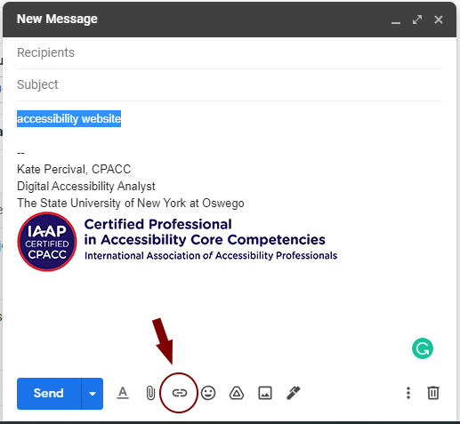
To insert a link:
- Highlight the appropriate text.
- Select the Link icon.
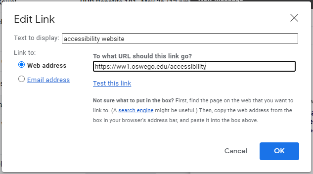
- Enter the web or email address in the appropriate dialog box.
- Hit OK.
Additional Resources
- Digital Accessibility Principles and Guidelines from the Deque course, "Effective Communication, Part 2"