Email Accessibility Guide
Digital content is accessible when it is created so that people experiencing an impairment or disability—whether permanent, temporary, or situational—can understand it. When content is accessible, it works with assistive technologies like screen readers, voice assistants (Siri, Alexa), speech-to-text, screen magnifiers, braille displays, and keyboards.
When emails are composed with accessibility in mind, they work better for everyone. While various email programs vary, these basic steps will help you improve your content's reach and clarity.
The examples below reflect the interface in Gmail.
Be Clear with the Subject Line and Preheader
Treat the subject line as the title of your email. Use the "Preheader" (the first line of text) for added context.
- Be succinct: Communicate the core message immediately.
- Provide context: Use the preheader to summarize the email so users can prioritize it before opening.
- Avoid: Excessive punctuation or ALL CAPS, which screen readers may read letter-by-letter.
Write in Clear and Simple Language
Plain language ensures your audience understands the message the first time they read it.
- Reading Level: Aim for a middle school (lower secondary) level.
- Organization: Put the most important info first and keep sentences short.
- Alignment: Keep text left-aligned. Avoid justified text, which is difficult for readers with dyslexia.
Structuring Content Using Styles Tools
Structuring "tags" your content so assistive technology can navigate logically.
- Use Headings: Use the Styles menu for Heading 1 or Heading 2. Do not manually bold text to create a header.
- Use Built-in Lists: Use the official bulleted or numbered list icons.
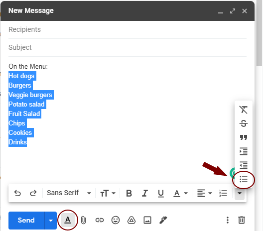
To Style a List in Gmail:
- Highlight the text.
- Open Formatting Options (the underlined “A”).
- Select the bulleted or numbered list ico
Consider Font Size and Style
- Minimum font size: 14 pt is the modern standard for body text.
- Legible fonts: Use sans-serif fonts like Open Sans, Verdana, or Roboto.
- Avoid script or decorative fonts that are difficult to read.
Explain Attachments
Provide a brief summary in the email body so users know what to expect.
- Context: Mention file type and size (e.g., "Attached: 2026 Report, PDF, 2MB").
- Single-page items: Include key content directly in the email body.
Provide Text Descriptions for Images
All graphics should have "Alt Text." If your platform lacks an alt-text field, describe the image in the body text.
- Informational images: Ensure dates, prices, or locations in the image are also written as text.
- Safety: Avoid GIFs that flash more than 3 times per second.
Be Aware of Color Cues and Contrast
- Don’t rely on color alone: Use Bold or Italics for emphasis.
- High Contrast: Use dark text on a light background.
- Dark Mode: Use transparent backgrounds for logos so they remain visible in dark themes.
Provide Descriptive Link Text
Links should describe the destination clearly for screen reader users.
- Be Descriptive: Use "Register for the Workshop" instead of "Click here."
- Avoid full URLs: Long web addresses are difficult when read aloud.
- Target Size: Ensure links have enough space around them to be easily tapped.
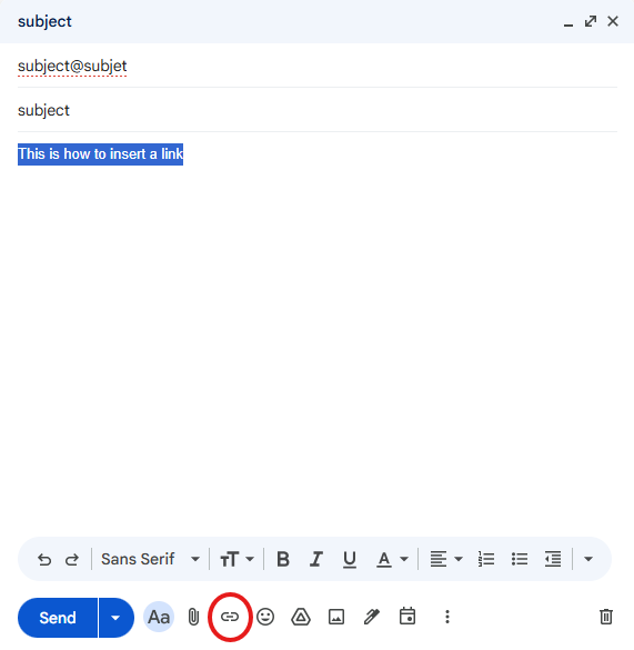
To Insert a Link:
- Highlight the descriptive text.
- Select the Link icon or use the keyboard shortcut Ctrl+K.
- Enter the URL and select OK.