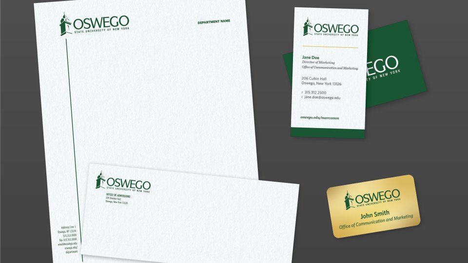
We are one branded university with many different departments, offices and organizations under one visual identity. We each strengthen the university’s awareness, recognition and professional appearance when we know and follow these branding standards.
Consistent use of Oswego logos communicates a unified visual message and enriches our brand. All communications for outside audiences should reflect their affiliation with SUNY Oswego, prioritizing university identification over individual departments or units.
Our logos include the primary cupola logo, the new secondary Spirit O logo, and the seal. Do not create unit logos, as competing graphics dilute SUNY Oswego’s brand equity.
Primary Logo: Historic Cupola
The primary logo, featuring the cupola atop historic Sheldon Hall, is SUNY Oswego’s main identifier and signifies quality and tradition. It should be used on most university communications.
Two approved versions of the primary logo provide flexibility: a preferred horizontal version and a vertical version. The horizontal logo, with “Oswego” and “State University of New York” centered to the right, uses specific typefaces (ITCSymbol Bold and Saturday Sans) and placements. Do not create your own logotype.
The cupola icon should always appear with the university wordmark. For standalone use of the cupola, obtain prior approval from the Office of Communications and Marketing.
Horizontal (Preferred)

Download PNG: Green | Black | White
Download EPS: Green | Black | White
Vertical

Download PNG: Green | Black | White
Download EPS: Green | Black | White
Primary Logo: Size
To ensure legibility, the height of the cupola symbol should generally not be less than 5/8 (0.625) inches. The height of the wordmark should not be less than 3/8 (0.375) inches. Allow comfortable visual space for the symbols by not placing other text or graphic images too close. Variations to the above may be allowed under special circumstances if prior approval is received from the Office of Communications and Marketing.
Primary Logo: Placement and Clear Space
SUNY Oswego identification should be integral to the overall design of all college publications. The logo should appear on the front cover, home page, or the equivalent location of all print, video and electronic materials. Unless prior approval is granted, the SUNY Oswego logo should not be obstructed by any other element or compete with other elements for prominence. Do not place words or other graphics too close to logo. Keep area around entire logo clear by 1/2 width of cupola. This clear space is the protected area around the logo that maximizes its impact.
Color Variations
The entire logo (symbol and wordmark) should appear in black, Oswego Green or its CMYK equivalent In some instances, the logo may also appear in Sunset Yellow (Pantone 1235 or 129 or the CMYK equivalent). White maybe used when on a solid color, Oswego green background color if possible.
Inappropriate Uses of the Historic Cupola Logo
- Outlined lettering
- Words and graphics too close/ Background not plain
- Distorted, not at 100% vertical
- College logo used in combination with other logo
- Two-toned logo or logo in two colors
- Cupola symbol used by itself/ College logo too small to read
- Cupola symbol used with inappropriate wordmark that is divided by department name.
- Avoid using college logo in collection of logos. Better to mention funding source within copy. It’s not necessary to always use logo.
Secondary Logo: Spirit O
The SUNY Oswego Spirit O is bold, optimistic and simple. It allows us to adapt and evolve our brand identity providing us with a fresh canvas to communicate our vision, values and offerings in a contemporary and relevant manner. It is designed to reflect the university’s progressive spirit while maintaining a sense of tradition and academic excellence. The “O” symbol embodies the spirit of the university with a bold and modern collegiate aesthetic while maintaining the university’s traditional color palette. The secondary logo is for use by student-centered units, athletics and other approved campus entities. The Spirit O does not replace the primary logo and should not be used on formal official materials.
Contact the Office of Communications and Marketing with questions regarding use.
Seal
Use of the official seal is typically reserved for formal and official documents such as certificates of academic recognition; legal and official records; transcripts; and programs for commencement, and other major ceremonial events. The seal should not be used as an alternative to the Oswego logo. Overuse will devalue the seal.
Contact the Office of Communications and Marketing with questions regarding use.

