
Tessa Sullivan

Tessa Sullivan 
Machias, NY
[email protected]

BFA Graphic Design, minor Illustration 

Biography

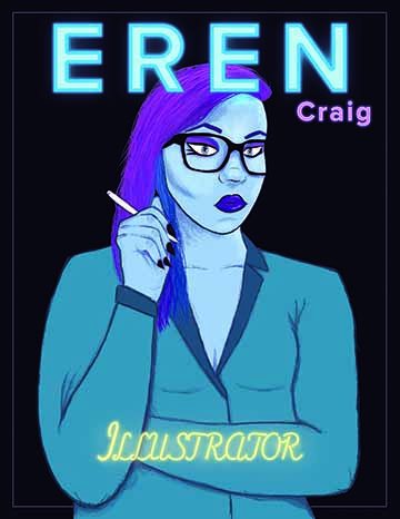
Tessa Sullivan is a graphic designer and an illustrator from a small town outside of Buffalo. She had changed her major from zoology to graphic design despite having no experience in digital art. Luckily that decision turned out pretty well. Since then, she has been in multiple SUNY Oswego juried art shows, and her illustration has been featured at the Maritime Museum in Oswego. She is planning to work in branding and do some freelance work on the side after graduation. 

Artist Statement

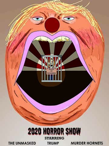
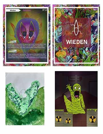
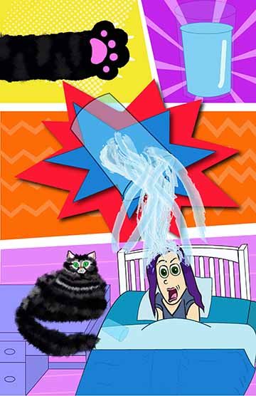
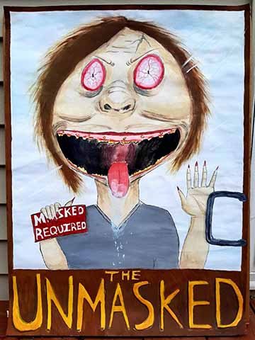
The reason I made the work shown is that I love working with textures, and I wanted to create work that could combine colors with typography and texture. When finding inspiration for my art, it could just be me seeing a random Instagram post that I like the style of or seeing a color combination I really like. Other times it’s a specific artist that I like or if something is happening in the world that I can’t stop thinking about, and I need to express my thoughts. I intended the work to catch the viewer’s attention, to have them think about what the story behind some of the work is. A lot of my work is created for fun. Most of the works don’t have a deep meaning behind them as I like to create whatever comes to mind. Through my creative process, I tried to investigate different ways of creating art. I came to love combining traditional and digital. I’m constantly trying to find a balance between my love for textures in traditional artwork and my love for flat artwork in digital.
 

This image features a neutral brown gradient in the background with a giant clown representing Trump in the middle. Inside of his mouth, there is a cage that has a deranged woman in it that represents the people who refuse to wear masks. Below him is the title of the piece 2020 Horror Show then on the bottom of the page it says it’s starring The Unmasked, Trump, and Murder Hornets. 

2020 Horror Show
Digital
5400 x 7211px (18 x 24 in) 
October 2020
407
This image features a neutral brown gradient in the background with a giant clown representing Trump in the middle. Inside of his mouth, there is a cage that has a deranged woman in it that represents the people who refuse to wear masks. Below him is the title of the piece 2020 Horror Show then on the bottom of the page it says it’s starring The Unmasked, Trump, and Murder Hornets. 

In this image it has multiple artworks showing the different stages and characters of the project. The one on the upper left shows an abstract flower with the colors purple, blue, pink,green and gold. It has a face on it that shows it sticking out its tongue in a playful manner. It then has red and orange leaves and stems growing off of it. The background shows two tree trunks behind it that are glowing green. The front of the card tells the name and the abilities of the character. The card on the upper rig

Accidental Characters
Digital
2550 x 3300px (8.5 x 11 in), 
December 2020
413
In this image it has multiple artworks showing the different stages and characters of the project. The one on the upper left shows an abstract flower with the colors purple, blue, pink,green and gold. It has a face on it that shows it sticking out its tongue in a playful manner. It then has red and orange leaves and stems growing off of it. The background shows two tree trunks behind it that are glowing green. The front of the card tells the name and the abilities of the character. The card on the upper right shows the back of the left card. It has an abstract background of swirled watercolors on it consisting of the colors, green, yellow, orange, pink, purple and blue. It has a white border around it with a red transparent box in the middle that shows the white logo of the card. The logo looks like a stretched out eye horizontally with four stems extending from it. On the bottom left it shows the beginning of another accidental character, it has shades of green splashed down on paper that is dissolving in some spots along with a light outline of what I wanted the character to look like. To the right of that is the finished character design. The character is a melting green blob with a frightened look on its face. The foreground shows three tubs of nuclear waste with a tub in the background spilled over with the green slime connecting to the melting character. The background is a setting of a dark factory with pipes all over the wall. 

This image is in the style of a comic. With four different panels separating the scenes, the first one you see a cat paw and next to it you see a glass of water. Then on the panel below that you see the water spilling over into the next panel. Then you see a girl that represents me getting soaked while the cat is sitting on the desk next to the bed indicating that the cat is the one who spilled the water off of the desk.

Before During After
Digital 
2442 x 3774px (11 x 17 in)
August 2020
313
This image is in the style of a comic. With four different panels separating the scenes, the first one you see a cat paw and next to it you see a glass of water. Then on the panel below that you see the water spilling over into the next panel. Then you see a girl that represents me getting soaked while the cat is sitting on the desk next to the bed indicating that the cat is the one who spilled the water off of the desk.

In this image is a deranged lady who is holding up a sign that says “maks required”, she has her mouth open as she’s licking the window of a door. On the door it says the title The Unmasked. 

The Unmasked
Mixed medium on watercolor paper.
22x30 in
July 2020
412
In this image is a deranged lady who is holding up a sign that says “maks required”, she has her mouth open as she’s licking the window of a door. On the door it says the title The Unmasked. 

This is a neon logo, it’s outlined in a circle with a guitar going through it in blue and the name of the band “The Backtalk Band” in the middle in green. Below that it says Ft. Hanna Martin in purple. 

The Backtalk Band logo
Digital
3768 x 2586 pixels
October 2019
307
This is a neon logo, it’s outlined in a circle with a guitar going through it in blue and the name of the band “The Backtalk Band” in the middle in green. Below that it says Ft. Hanna Martin in purple. 

This portrait is of my Friend Eren, with a neon type that says her name and what their major is in a magazine cover style. She is shown from the waist up holding her drawing pen with her arm crossed in front of her. The color scheme of her is blues and purples including her skin being blue. Her expression is fierce while having bold purple makeup to match her purple hair. She is wearing a business jacket that is a dark blue, in front of her written on her crossed arm is “Illustrator” that is glowing yellow.

Eren Magazine Cover
Digital
2550 x 3300 pixels (8.5” x 11”)
March 2021
Independent Study
This portrait is of my Friend Eren, with a neon type that says her name and what their major is in a magazine cover style. She is shown from the waist up holding her drawing pen with her arm crossed in front of her. The color scheme of her is blues and purples including her skin being blue. Her expression is fierce while having bold purple makeup to match her purple hair. She is wearing a business jacket that is a dark blue, in front of her written on her crossed arm is “Illustrator” that is glowing yellow. Her name is glowing blue and overlaps her head with her last name being below her first name and on the right of her written in purple with a slight glow. The overall style is clean with the shadows and highlights having more of a dry texture. The background color is a really dark blue with a thin white rectangle border that goes behind her. 

This poster shows a sunset done in a painterly style in the background. The main colors are blues for the clouds near the top and oranges, reds, and yellows for the reflection on the water and the sky above the sunset. The foreground features a mountain on the left and right side of the poster that are grey and blue towards the viewer with some of the colors of the water reflected on the other side of the mountains. In the sky written in white is the name of the park with black birds flying towards it getti

Wrangell St. Elias, National Park Poster
Digital
5042 x 6807 pixels 
April 2020
313
This poster shows a sunset done in a painterly style in the background. The main colors are blues for the clouds near the top and oranges, reds, and yellows for the reflection on the water and the sky above the sunset. The foreground features a mountain on the left and right side of the poster that are grey and blue towards the viewer with some of the colors of the water reflected on the other side of the mountains. In the sky written in white is the name of the park with black birds flying towards it getting smaller as they recede into the sky. On the right mountain written on the bottom in white it says Alaska national park.

This post has a dark blue border with a black background in the middle with tiny white stars that are scattered. It has a light grey overlay that creates an outline of a cat with a wide smile to mimic the cheshire cat smile. On the left upper corner is an outline of a teapot with musical staffs coming out of it leading down to the bottom right corner. Following the staff is outlines of a yellow bell tower, a blue tophat, an orange lighthouse with green, blue, pink fireworks behind it, and a green ferris whe

Harborfest 
Digital
3196 x 3806 pixels
December 2019
307
This post has a dark blue border with a black background in the middle with tiny white stars that are scattered. It has a light grey overlay that creates an outline of a cat with a wide smile to mimic the cheshire cat smile. On the left upper corner is an outline of a teapot with musical staffs coming out of it leading down to the bottom right corner. Following the staff is outlines of a yellow bell tower, a blue tophat, an orange lighthouse with green, blue, pink fireworks behind it, and a green ferris wheel. Following the music staff are music notes that get smaller as they recede into the background. On the bottom it has the date with a grey outline of a girl with a bow looking up. Then on the very top it has the name of the event and the location. 

On the outside of the menu there is an orange background with a light orange zig zag going through the middle. On the front there is the restaurant logo, the background is a blue geometrix spiky shape with a pink lightning bolt shape on top of it with the name of the restaurant sitting on top of the bolt. The inside of the menu is purple with various sizes of orange and purple circles around the border. Then it has the different foods and drinks that are served, the names are based off of popular 90’s shows

Restaurant Menu 
Digital
14w x 11h
March  2019
209
On the outside of the menu there is an orange background with a light orange zig zag going through the middle. On the front there is the restaurant logo, the background is a blue geometrix spiky shape with a pink lightning bolt shape on top of it with the name of the restaurant sitting on top of the bolt. The inside of the menu is purple with various sizes of orange and purple circles around the border. Then it has the different foods and drinks that are served, the names are based off of popular 90’s shows.

The first poster shows grey text that says “ Music for everyone” with everyone being on the bottom and a fake Spotify logo advertising earbuds being shown in the middle. The logo says Pair with its signature three green arcs symbolizing sound waves above it. Behind that, there are different size bubbles with a blue to orange pastel gradient in them. Below the logo, it says “Earbuds by Spotify” with a fake website to buy the earbuds.

Spotify Ad Poster 
Digital 
11 x 17
May 2020
308
The first poster shows grey text that says “ Music for everyone” with everyone being on the bottom and a fake Spotify logo advertising earbuds being shown in the middle. The logo says Pair with its signature three green arcs symbolizing sound waves above it. Behind that, there are different size bubbles with a blue to orange pastel gradient in them. Below the logo, it says “Earbuds by Spotify” with a fake website to buy the earbuds.

This piece shows the series of the Oswego reading initiative. On the top left side it shows the poster, in the middle of the poster it has an abstract watercolor eye illustration that shows a purple night sky. The iris of the eye is black with white stars surrounding it, the bottom of the eye shows a desert landscape with an orange sunset that transitions into the night sky. In the middle of the brown hills is a path that leads down towards the event info while slowing dissolving away. On the front of the e

ORI 2021
Digital 
8.5 x 11
April 2021
414
This piece shows the series of the Oswego reading initiative. On the top left side it shows the poster, in the middle of the poster it has an abstract watercolor eye illustration that shows a purple night sky. The iris of the eye is black with white stars surrounding it, the bottom of the eye shows a desert landscape with an orange sunset that transitions into the night sky. In the middle of the brown hills is a path that leads down towards the event info while slowing dissolving away. On the front of the eye written in black white a white outline is the name of the book “Knitting the Fog”. Above that on the left side it shows a picture of the book, with ORI 2021 written in purple on the left side of it. Below the eye it has a picture of the Author with the oswego and ORI logo below it. On the right side of that is the event information. On the right side of the poster is the brochure design. The top image shows the front, the middle panel is the back design, and the left panel shows the inner flap design. The front design shows the eye illustration with the name of the book on front, and on the bottom it has a picture of the author. The middle panel has the past ORI selections along with the oswego and ORI logo below it. The left panel has the event information with a picture of the book in the middle with a purple background while the rest of the pages have a light tan color. The image below shows the inner design of the brochure. The left panel has the past ORI committee and with a paragraph to the students. The middle and right panel has a purple background with another picture of the author, information about her, and information about the book. Below the text is a small illustration of desert hills with a washed out yellow watercolor sunset behind them. Lastly throughout all the panels there are random splashes of purple and orange watercolor. Below the poster is the design for the bookmark, on the front it shows a zoomed in picture of the eye illustration with the purple sky and brown desert. In front of the illustration it has the name of the book in white with ORI written in the upper left corner. On the back of the bookmark is the event information along with the picture of the book and the author.

This artwork has a pale purple background with a thin dashed white line around the border. The portrait in the middle is inspired by cubism, with thick black lines for the outlines. The head floats slightly above the neck with blue on one half of the head and pink on the other. The wavy hair is bright orange with dark and light orange lines going through the strands, the facial expression is very happy with simple line work. Lexi is wearing a bright yellow hawaiian style shirt with a pale yellow shirt under

Lexi Magazine Cover
Digital
8.5 11 
April 2021
Independent Study
This artwork has a pale purple background with a thin dashed white line around the border. The portrait in the middle is inspired by cubism, with thick black lines for the outlines. The head floats slightly above the neck with blue on one half of the head and pink on the other. The wavy hair is bright orange with dark and light orange lines going through the strands, the facial expression is very happy with simple line work. Lexi is wearing a bright yellow hawaiian style shirt with a pale yellow shirt underneath. The hawaiian shirt has a bright yellow line pattern on the collar and cuffs with the rest being a dotted pattern. They have their hands up as if they are surprised with the left side being blue and the right being pink. The shading is done in a pop art style with lots of dots and lines. On the bottom it says “ Graphic Designer” in dark purple with a white outline and at the top of the artwork it shows their name Lexi Gonzalez written in purple.