
Taylor Powderly

Taylor Powderly
Rochester, NY
[email protected] 

BFA Graphic Design

Biography

Taylor Powderly is a graphic designer from Rochester, New York. 
Her interest in graphic design began in high school when she started creating mock-up print advertisements for brands like Cheerios. She went on to study graphic design at Johnson & Wales University for a year and then moved back to New York to attend SUNY Oswego. 
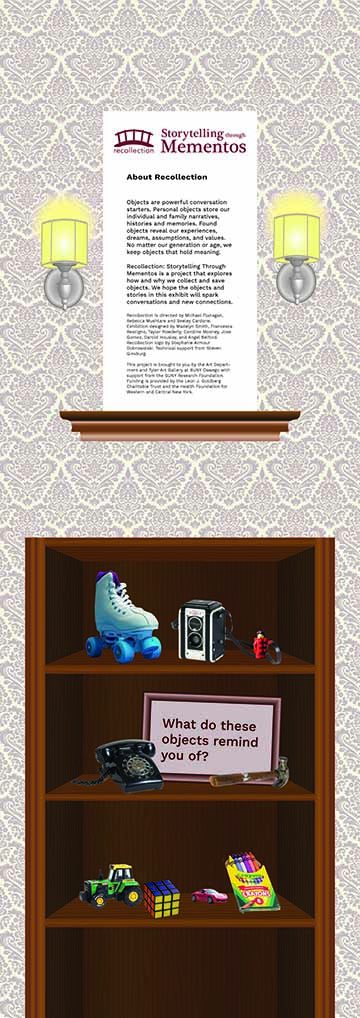
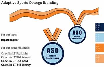
Once attending Oswego, she gained an interest in art history and pursued it as a minor. She was a member of the design team for Vote Oswego for the 2020 election. She also worked on an interactive exhibit entitled Recollections that was designed for long-term care facilities, specifically members of the Alzheimer's community. She loved working on teams with her peers and seeing all of the different talents they bring. In the future, she hopes to work at a large firm in advertising and branding, as well as continuing to mix digital and hand-drawn aspects in her work.

Artist Statement

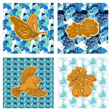
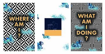
I love creating work that serves a purpose but with unexpected results. Utilizing tools that I have learned through my education, I enjoy combining my interests and putting my own hand in the design, whether that be scanning in hand-drawn aspects and manipulating them digitally or creating work that resonates with myself and my interests. 

During my time at SUNY Oswego, I have explored many different areas of art, and with each piece, I create I find inspiration from different sources. I love creating designs that cut across media, whether digital or print, to create a more diverse body of work. The pieces in this exhibit show my dedication to the message that my designs put out. My goal as a designer is to create work that is effective and catches the eye of the viewer. 
 

This large scale exhibition intro panel has a home setting, with a bookcase with imagery to evoke storytelling. Above the bookcase is a shelf with an image containing information about the exhibit. Alongside the image are small sconces atop a wallpapered wall.

Recollections Intro Panel
Digital, Adobe Illustrator
36” x 90”
2020
ART 333
This large scale exhibition intro panel has a home setting, with a bookcase with imagery to evoke storytelling. Above the bookcase is a shelf with an image containing information about the exhibit. Alongside the image are small sconces atop a wallpapered wall. 

This piece is a label for Aloe Vera gel. It has green Aloe Vera leaves across the entire center, as well as information about the product split into sections. Complete with a blue Natur Sense logo at the top.

Aloe Vera
Digital, Adobe InDesign
5 x 7
2020
ART 308
This piece is a label for Aloe Vera gel. It has green Aloe Vera leaves across the entire center, as well as information about the product split into sections. Complete with a blue Natur Sense logo at the top.

This poster is a promotional material for the musical Fun Home. it includes a hand drawn image of a hand holding up a polaroid of a silhouette of a daughter and her dad under a gateway. The background is a light blue watercolor, and the bottom section is a bright pink with information about the show. 

Fun Home Poster
Digital, Adobe Illustrator 
11 x 17
2018
ART 323 
This poster is a promotional material for the musical Fun Home. it includes a hand drawn image of a hand holding up a polaroid of a silhouette of a daughter and her dad under a gateway. The background is a light blue watercolor, and the bottom section is a bright pink with information about the show. 

This piece has a blue watercolor background with a hand drawn image of a hand holding up the title of the play “Fun Home” along with text with information about the SUNY Oswego show. 

Fun Home Digital Ad
Digital, Adobe Illustrator
1921 × 1442
2018
ART 323
This piece has a blue watercolor background with a hand drawn image of a hand holding up the title of the play “Fun Home” along with text with information about the SUNY Oswego show. 

This piece is a magazine cover for an article and edition presenting the work of Shepard Fairey. 

Shepard Fairey 1
Digital, Adobe InDesign 
8.5x11
2019
ART 408
This piece is a magazine cover for an article and edition presenting the work of Shepard Fairey. 
 

This first spread has visual elements including shapes referring to the work of Shepard Fairey. An image on the second page of a mural by the artist ties in with the text.

Shepard Fairey 2
Digital, Adobe InDesign 
11x17 spread
2019
ART 408
This first spread has visual elements including shapes referring to the work of Shepard Fairey. An image on the second page of a mural by the artist ties in with the text.

This piece is a magazine cover for an article and edition presenting the work of Shepard Fairey. 

Shepard Fairey 3
Digital, Adobe InDesign 
11x17 spread 
2019
ART 408
This piece is a magazine cover for an article and edition presenting the work of Shepard Fairey. 

This piece is 4 squares, with the backgrounds of the squares patterned blue stamped images from body parts and paint. On top of the patterns are 4 visual images, a butterfly, roses, a bird, and pears, in orange/yellow colors. 

Stamped Life 
Digital, Adobe Illustrator and Procreate 
30 x 30
2021
ART 205
This piece is 4 squares, with the backgrounds of the squares patterned blue stamped images from body parts and paint. On top of the patterns are 4 visual images, a butterfly, roses, a bird, and pears, in orange/yellow colors. 

This is a series of 3 posters, all in one, the two outside posters have geometric optical illusion type patterns in the background and words on top of them. the first poster says “Where am I?” and the last poster says “What am I doing?” and the center poster is a simple line drawing of myself sitting at my desk doing work. Clouds created from prints of parts of my body span across all 3 posters to tie them together. 

Current State of Mind
Digital, Adobe Illustrator and Procreate 
37 x 19 
2021 
RT 205
This is a series of 3 posters, all in one, the two outside posters have geometric optical illusion type patterns in the background and words on top of them. the first poster says “Where am I?” and the last poster says “What am I doing?” and the center poster is a simple line drawing of myself sitting at my desk doing work. Clouds created from prints of parts of my body span across all 3 posters to tie them together. 

This is a page of a brand development for an fictitious business, Adaptive Sports Oswego. The images on this board include the logo which is an orange and blue medal with the name. This also includes the color scheme used for the business, oranges and blues, as well as the typefaces that can be used for the logo as well as print materials. 

Adaptive Sports Oswego
Digital, Adobe Illustrator
17x11
2019
ART 408
This is a page of a brand development for an fictitious business, Adaptive Sports Oswego. The images on this board include the logo which is an orange and blue medal with the name. This also includes the color scheme used for the business, oranges and blues, as well as the typefaces that can be used for the logo as well as print materials.