
Megan Smith

Megan Smith
Oswego, NY
[email protected]

BFA Graphic Design

Biography

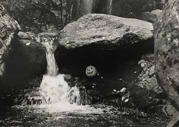
Megan Smith is from Oswego, NY. She first attended Finger Lakes Community College, where she got her Associate's Degree in Graphic Design. She then transferred to SUNY Oswego to earn her BFA Degree in Graphic Design. While studying at SUNY Oswego has she explored the various fields of graphic design. She has also enjoyed taking photography classes and learning about branding and packaging design the most. 
 

Artist Statement

It was during my sophomore year of high school that I found a passion for Graphic Design. As I went through high school and took a graphics class every year, I decided that this is a profession that I wanted to pursue in life. 

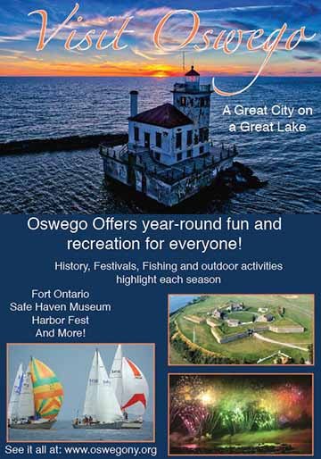
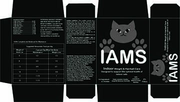
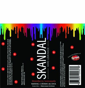
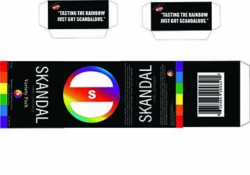
I don't have one main area of concentration in graphic design. I like to explore the different areas of the field. The pieces that I choose for this exhibit show different areas of art that I enjoy doing. Some of those areas include photography, branding and packaging, and poster designs. 

The title Visit Oswego is in a script font. The color of the text is orange picked from colors in the image that it sits on. To make the text stand out more there is a white stroke around the text. The top image is a picture of Lake Ontario's lighthouse with the sunset behind it. Below the top image the background color is a blue that is also drawn from the image above. On the bottom half there are three more pictures showing different events Oswego has to offer. The images are showing fireworks from Harbor

Visit Oswego
Illustrator
7x10in
2/22/21
ART 414
The title Visit Oswego is in a script font. The color of the text is orange picked from colors in the image that it sits on. To make the text stand out more there is a white stroke around the text. The top image is a picture of Lake Ontario's lighthouse with the sunset behind it. Below the top image the background color is a blue that is also drawn from the image above. On the bottom half there are three more pictures showing different events Oswego has to offer. The images are showing fireworks from Harborfest, Sailboats on the lake, and the Fort. Around each image has an orange stroke to bring unity to the poster. 

The box is black with a little animated cat on the front as the logo. The cat is in a lighter grayish color so it doesn't stand out too much. The paws of the cat sit behind the name of the company, Iams. 

Iams 
Illustrator
16x9 in
2/24/20
ART 308
The box is black with a little animated cat on the front as the logo. The cat is in a lighter grayish color so it doesn't stand out too much. The paws of the cat sit behind the name of the company, Iams. 

The box is black with a little animated cat on the front as the logo. The cat is in a lighter grayish color so it doesn't stand out too much. The paws of the cat sit behind the name of the company, Iams. 

Iams 
Illustrator
16x9 in
2/24/20
ART 308
The box is black with a little animated cat on the front as the logo. The cat is in a lighter grayish color so it doesn't stand out too much. The paws of the cat sit behind the name of the company, Iams. 

Skandal is based on the candy Skittles. It is not candy but an alcoholic beverage. Our packages that we created incorporated parts of the Skittle packaging. The label and box is black with the rainbow dripping down from the top of the can. On each label depending on the flavor there are mini skittles in the color of the flavor, for one there are red skittles representing the strawberry flavor.

Skandal
Illustrator
7.5x5in
3/10/20
ART 308
Skandal is based on the candy Skittles. It is not candy but an alcoholic beverage. Our packages that we created incorporated parts of the Skittle packaging. The label and box is black with the rainbow dripping down from the top of the can. On each label depending on the flavor there are mini skittles in the color of the flavor, for one there are red skittles representing the strawberry flavor.

Skandal is based on the candy Skittles. It is not candy but an alcoholic beverage. Our packages that we created incorporated parts of the Skittle packaging. The label and box is black with the rainbow dripping down from the top of the can. On each label depending on the flavor there are mini skittles in the color of the flavor, for one there are red skittles representing the strawberry flavor.

Skandal
Illustrator
7.5x5in
3/10/20
ART 308
Skandal is based on the candy Skittles. It is not candy but an alcoholic beverage. Our packages that we created incorporated parts of the Skittle packaging. The label and box is black with the rainbow dripping down from the top of the can. On each label depending on the flavor there are mini skittles in the color of the flavor, for one there are red skittles representing the strawberry flavor.

Rising Vines was for a class that makes wines every semester. They are located near the finger lakes. On my label I made the background a darker purple color. In the center of the label I have an outline of a wine glass that is a little darker than the label color, in the wine glass I have the 4 finger lakes. I have the name of the wine in yellow letters with vines with grapes on them coming out of the letters. On the ends of the label I have a level bar showing the sweetness or dryness of the wine, a littl

Rising Vines
Illustrator
13x4in
11/27/18
ART 215
Rising Vines was for a class that makes wines every semester. They are located near the finger lakes. On my label I made the background a darker purple color. In the center of the label I have an outline of a wine glass that is a little darker than the label color, in the wine glass I have the 4 finger lakes. I have the name of the wine in yellow letters with vines with grapes on them coming out of the letters. On the ends of the label I have a level bar showing the sweetness or dryness of the wine, a little excerpt of the wine. I also added what you can pair the wine with in regards to food. 

A black and white image of me sitting down at my desk with my computer in front of me to show one way covid has impacted life. On the top right is part of an article explaining how schools have been closed since March. 

Covid 1
Digital Photo
16x9in
11/16/20
ART333
A black and white image of me sitting down at my desk with my computer in front of me to show one way covid has impacted life. On the top right is part of an article explaining how schools have been closed since March. 

Another black and white photo in the same series as the one above that shows the impact of covid. In this photo is another self portrait of me looking off to the side wearing a mask. At the bottom of the photo is another article description stating how many cases of covid we have had in the US.

Covid 2
Digital Photo
22x14in
11/16/20
ART333
Another black and white photo in the same series as the one above that shows the impact of covid. In this photo is another self portrait of me looking off to the side wearing a mask. At the bottom of the photo is another article description stating how many cases of covid we have had in the US.

This image is the third one in the Covid series. In this photo I did a side profile facing the left. I am wearing a mask to go with the article about how much masks protect you against the virus.

Covid 3
Digital Photo
16x9in
11/16/20
ART333
This image is the third one in the Covid series. In this photo I did a side profile facing the left. I am wearing a mask to go with the article about how much masks protect you against the virus.
 

This is a black and white photo of a person laying on the ground underneath a park bench. The holes in the bench creates an interesting pattern on her face as the sunlight hits the bench.

Shadow
Digital
16x9in
10/1/18
ART110
This is a black and white photo of a person laying on the ground underneath a park bench. The holes in the bench creates an interesting pattern on her face as the sunlight hits the bench.

This photo is a black and white image of a pumpkin sitting under a rock next to a little waterfall. 

Jack O Lantern
Film
10x7in
Fall 2019
ART340
This photo is a black and white image of a pumpkin sitting under a rock next to a little waterfall. 

This is another black and white image of a close up of the pumpkin sitting on a rock with a bigger waterfall behind it. 

Jack O Lantern 2
Film
10x8in
Fall 2019
ART340
This is another black and white image of a close up of the pumpkin sitting on a rock with a bigger waterfall behind it. 

This black and white photo is an image taken on the sidewalk next to the river. On the right there is a railing  that turns to trees farther down. On the left side is a concrete wall that also has trees that start farther down. The sides help frame the sidewalk as it disappears and looks like it gets narrower as it goes.

River Walk
Film
10x6in
Fall 2019
ART340
This black and white photo is an image taken on the sidewalk next to the river. On the right there is a railing  that turns to trees farther down. On the left side is a concrete wall that also has trees that start farther down. The sides help frame the sidewalk as it disappears and looks like it gets narrower as it goes.

This black and white is a blurred image of a street in Oswego. Although the image is blurred, on the left side of the photo there is half a truck, you can see the back window and the truck bed. The trees that were around created black swoosh lines on top of the image.

Truck
Film
11x11in
Fall 2019
ART340
This black and white is a blurred image of a street in Oswego. Although the image is blurred, on the left side of the photo there is half a truck, you can see the back window and the truck bed. The trees that were around created black swoosh lines on top of the image.