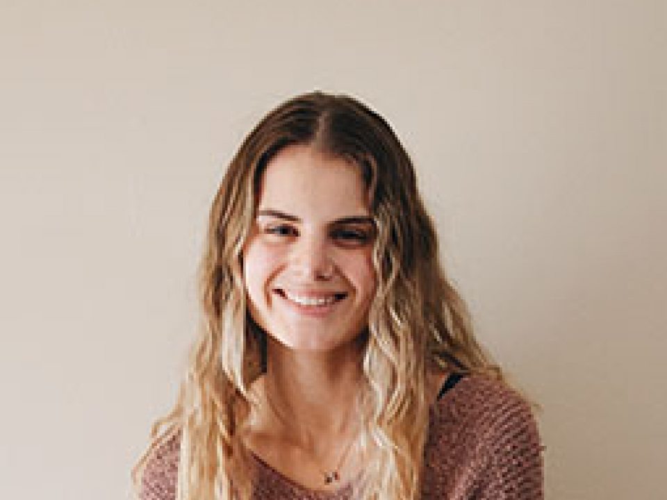
Francesca Rescigno

Francesca Rescigno
Graphic Design BFA
Baldwinsville, NY
[email protected]
Francesca's Behance

Biography

Francesca Rescigno is a Graphic Designer from Rome, New York. She attended Notre Dame Junior-Senior High School, where she pursued her creative side by participating in annual school musicals and graduated in 2017 as a National Honor Society member. She spent a year as a Graphic Design major at SUNY Brockport before transferring to SUNY Oswego in the fall of 2018, where her love for graphic design truly blossomed. 

Rescigno has experimented in various graphic design fields but has found a passion for branding and web design, where she places a strong emphasis on accessibility. During quarantine, Rescigno started a podcast called Riveting Rosies that focuses on female empowerment and sharing the stories of female entrepreneurs. This experience has allowed her to explore a different medium, make many meaningful connections, and has opened her eyes to the versatility of the online world. After graduation, she will be expanding her business, The Passions Collective, and plans to utilize the freedom of being self-employed to travel as much as possible.

Artist Statement

Creativity has been something that has ebbed and flowed in my life for as long as I can remember. The first thing I remember being passionate about creatively was photography. I got my first camera when I was around ten years old and spent the next couple of years taking pictures of anything and everything. It was also around this time that I was first introduced to (very basic) web design for the blog that I ran to share my photography. 

Throughout high school, I lost interest in most aspects of art. I expressed my creativity by participating in musicals, but that was the extent of it during those years. In fact, toward the end of my high school career, when I was figuring out what I wanted to do in college, pursuing an art-related degree was never even on my radar. It's funny how things really do end up coming full circle. 

During my time at SUNY Oswego and the 2+ years I've spent here, I've been able to experiment in many different digital mediums and get in touch with my creative roots again. I have developed a work style that I would describe as minimalistic, organic, and incorporating thoughtful use of color. I take a lot of inspiration from my surroundings, which is one of the reasons why I'm so passionate about traveling. 

50s themed diner menu with pastel pink and blue color scheme, menu is tri-fold and lists food in various categories

Popa’s Diner Menu
 InDesign
11x17 Tri-Fold
2018
Typography

50s themed diner website displayed at various screen sizes including iPhone, iPad, Macbook and iMac

Popa’s Diner Website
Website (HTML + CSS)
Various
2019
Web Media II
50s themed diner website displayed at various screen sizes including iPhone, iPad, Macbook and iMac

mockup of a variety of print materials that feature the seniors for seniors logo which includes a minimalistic line drawing of a person with their arms around a cat and dog

Seniors for Seniors Branding    
Illustrator
Scalable
2020
Branding + Packaging
Mockup of a variety of print materials that feature the seniors for seniors logo which includes a minimalistic line drawing of a person with their arms around a cat and dog

earth toned website for seniors for seniors displayed at various screen sizes including iPhone, iPad, Macbook and iMac

Seniors for Seniors Website
Website (HTML + CSS + Javascript)
Various
2020
Graphic Design Practicum
Earth toned website for seniors for seniors displayed at various screen sizes including iPhone, iPad, Macbook and iMac

tall can of mike’s hard lemonade, with minimalist packing and branding focusing on a dark maroon color to coincide with the black cherry flavor

Mike’s Hard Rebrand
InDesign
Tall Can
2020
Branding + Packaging
Tall can of mike’s hard lemonade, with minimalist packing and branding focusing on a dark maroon color to coincide with the black cherry flavor

hard honey candy that appears in a slide-out gum wrapper package, colors blend in a gradient from muted yellow to green to mimic those of a mojito

Title: Hard Honeys Packaging
InDesign
Gum Package
2020
Branding + Packaging
Honey candy that appears in a slide-out gum wrapper package, colors blend in a gradient from muted yellow to green to mimic those of a mojito

turquoise blue stickers that feature The Hair Witch Tiff logo that has a hand holding a pair of shears, surrounded by stars, a moon + a crystal

The Hair Witch Tiff Stickers
Illustrator
2x2”
2020
Turquoise blue stickers that feature The Hair Witch Tiff logo that has a hand holding a pair of shears, surrounded by stars, a moon + a crystal

dark maroon t-shirt that features The Hair Witch Tiff logo that has a hand holding a pair of shears, surrounded by stars, a moon + a crystal

The Hair Witch Tiff T-Shirt
Illustrator
Various
2020
Dark maroon t-shirt that features The Hair Witch Tiff logo that has a hand holding a pair of shears, surrounded by stars, a moon + a crystal